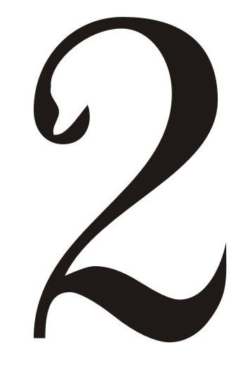

One of the goals of the Board for 2014 was making new brand and visual identities of the project. This was done because promotional activities and media recognisability are very important for acquiring the status of a candidate, as well as for promoting candidacy among citizens, whose role is crucial in this process. When producing design, simplicity was taken into account. Following the long standing practice of previous European Capitals of Culture, authors focused on the importance of the year of the title. The visual identity of the project Novi Sad 2021 was made in a way that insisted on symbolic meaning of numbers of the year of the title, but it also took into consideration certain symbols of Novi Sad. When creating the logo, they used numbers 20 and 21 and punctuation in a way that after number 20 goes comma, and behind number 21 full stop. This design simultaneously represents counting of years (and centuries) to the year when Novi Sad bids for the title of European Capital of Culture. Apart from that, the number 2 has been modified to resemble a swan, and given that there are two number 2 – they symbolise Isa and Bisa, swans that are one of the modern symbols of our city. Part of the new logo is the new motto – CULT TOUR, which is part of the new brand of the candidacy. Within logo, designers also used four basic themes of the strategy Novi Sad 2021, which are symbolised with lines and arranged gradually from the topic Re-connect, then Empower and Localize, i order to complete the whole with the last topic EuropeaNS, which is spatially encircled by lines.